Leah Rose Foster
VISUAL DESIGNER
Augusta Health Contractor Work (2020)
Note: Once you are finished here, please head over to my Social Marketing and Animation pages, where you will find more designs and work completed for Augusta Health.
Design for Print
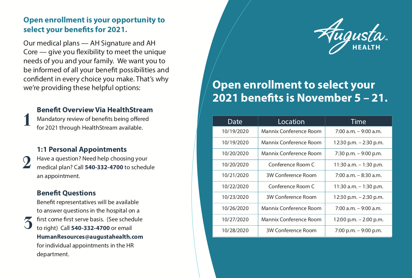
Open Enrollment Newsletter, Benefits Guide, Postcard, Flyer (2020)
OVERVIEW
This was a multi-component project for open enrollment benefits for Augusta Health employees (internal marketing). The task was to re-design and update last year’s materials using new copy from our contracted copyrighter. This was also one of the first times we used the branding palette that is being developed for our rebrand. The goal was to encourage employees to take advantage of their benefits and enroll. Please feel free to use the arrows to scroll through these materials, and click the links below to see each individually. (Note: I also worked on the Open Enrollment Newsletter and Benefits Package, but did not include them for privacy reasons). Postcard, Flyer


Rack Cards, and Pamphlets (2020)
OVERVIEW
In this section you will find multiple rack cards and pamphlets that were created for the Cancer Center, Bereavement, Meds to Beds, and oxygen safety. Please feel free to use the arrows to scroll through these materials, and click the links below to see each individually.
Prevent at Augusta Health, Know Your Cancer Risk, Bereavement, Meds to Beds, Oxygen Safety


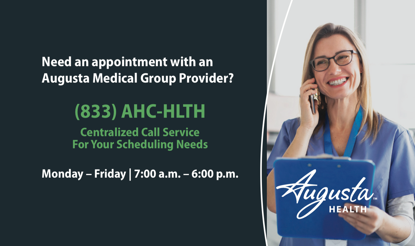
News Virginian Ad- Centralized Calling Service
OVERVIEW
The goal of this advertisement was to have patients make their appointments through our centralized calling service. It was paired with our #fluface advertisement.
Don’t Delay Campaign: Heart Risk and Screenings Push
OVERVIEW
The goal of this campaign was to encourage patients to make appointments, and not abandon their health due to the pandemic. We wanted to ensure that patients knew our facilities were clean and safe, and they didn’t have to push their health aside. Here are two digital billboards I created for this campaign.


LtGrey Creative Summer Advertising Internship (2019)
Merchandise Design for 1623 Brewing Company (2019)
OVERVIEW
During my internship at Lt Grey Creative, I worked with 1623 Brewing company. 1623 is a based in Maryland and is family owned, extending from Maryland to Colorado. The assignment for this project was to propose t-shirt and merchandise designs to be sold on their website. Please feel free to use the arrows to scroll through my favorite designs


1623 Beer Label Resize (2019)
OVERVIEW
The task was to resize 1623’s beer can labels to fit the new can size. The challenge was that the original branding company for 1623 did not have the native art file they used to design the core beers. Therefore, my Photoshop and Illustrator skills were being put to the test. Essentially, I had to recreate all of the things on the original label using masks, image traces, you name it. Please feel free to use the arrows to scroll through the beer labels.


SMAD Visual Design Coursework
Note: To see SMAD coursework in UX/UI Research and Design, please visit my UX Research and Design page.
SAPPI Grant Proposal (2019)
OVERVIEW
The assignment was to develop a grant proposal for SAPPI Paper that would help support Blue Ridge Area Food Bank and the Gus Bus. The goal was to show SAPPI how they can use their paper to connect the Gus Bus to BRAFB on a deeper level, using education and nutritional health. This proposal did not win the grant, but was named "honorable," and was encouraged to re-enter the following year. Please feel free to use the arrows to scroll through the highlights from the campaign.
You can view the full proposal here: SAPPI


Community Care and Learning Center Re-Branding (2019)
OVERVIEW
For this assignment, we were asked to work directly with Community Care and Learning Center to rebrand their business. We were asked to create vertical and horizontal business cards, letterheads, logos, and mockups of their new branding on social media that helped express values of trust, growth, caring, and most importantly community. Please feel free to use the arrows to scroll through the examples of how my branding would have been used if chosen from this competition.


Design for Digital
Community Care Bulletin (2020)
OVERVIEW
The Community Care Bulletin is a collaborative team effort to send information and tips out to our audience on a monthly or urgent-message basis via email. Right now, we have one bulletin being sent a month, and we have had a few urgent messages sent due to the COVID-19 pandemic. Below, you will be able to scroll through some of the designs I created for these bulletins, as well as the overall design of the bulletin for reference of how my pieces fit into the whole. (Note: Many of these designs were repurposed for social).


Social Media Designs (2020)
OVERVIEW
Our goal is to boost engagement, gain followers, and send useful and informative messages to our target audience in the hopes of patients choosing our facilities for care. Please use the arrows below to click through some of the designs I made for our Instagram, as well as Facebook and Twitter. If you’d like to see more about how we determined our Instagram marketing strategies against our competitors, please check out my Social Marketing page. If you would like to see some of the animations I created for these platforms, please visit my Animation page.


Breast Cancer Awareness Digital Billboard
OVERVIEW
The inspiration behind this billboard came from our contracted copyrighter. He said we spend so much time looking in the mirror, while we should be focusing on what’s inside, and our health. The idea was to have a woman looking in the mirror, wiping away the fog on the glass, and “wiping away uncertainty” about her breast health, encouraging women to schedule their mammograms.

HR Learning Journal
OVERVIEW
The HR learning journal was a collaborative effort among the team. The goal was to create a coherent, visual story about who we are, and how our team members work together to care for our community. Pulling stock imagery, creating infographics, and working on page layout were some of the tasks I was assigned with this project. There is no preview for this project due to privacy reasons.
Sticker Design for Fenwick Ice Company (2019)
OVERVIEW
Fenwick Ice Company (FIC) came to LtGrey Creative as a brand new company. They needed a logo design, merchandise, branding, etc. They wanted to be a shaved ice shop in Fenwick Beach, Delaware. FIC wanted minimal, thin lines, but for it to look like the modern, "hip" style you see around local coffee shops, etc., so they could appeal to young audiences. I chose to create sticker mockups for merchandise sales.
Menu Redesign for Bull On The Beach (2019)
OVERVIEW
The task for this menu redesign was to compile three menu pages into a one-sided late night menu that could have food or merchandise printed on the back. At the time I was designing this, they were unsure of what they wanted to print on the back. I was to incorporate their typical fonts and colors.

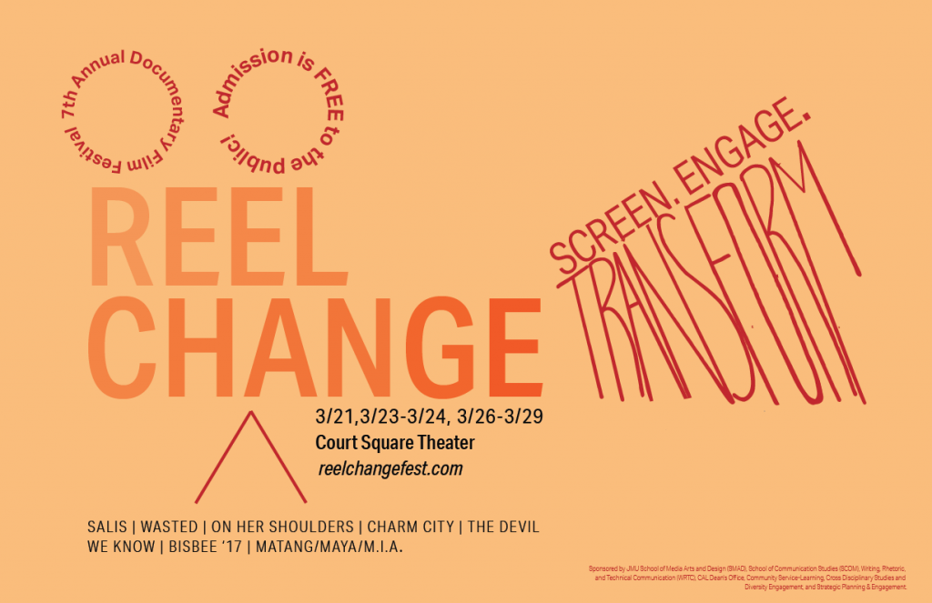
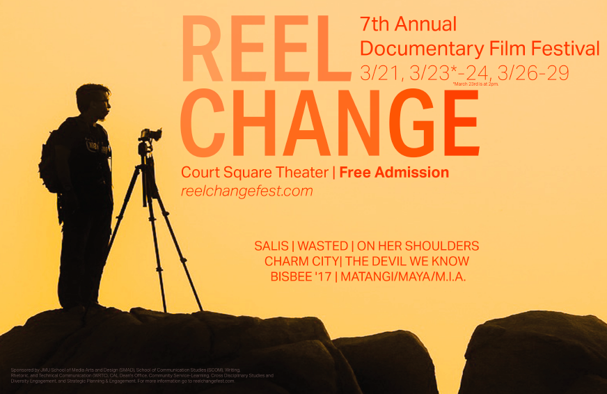
Reel Change film festival (2019)
OVERVIEW
The Reel Change Film Festival is a documentary film festival that is held annually at JMU. The requirements for this poster design project was to create two different posters, one strictly made of vectors, and one that was raster based. The two posters were supposed to be able to be looked at side by side and work together to evoke a common theme. Please feel free to use the arrows to scroll, where you’ll find the second poster.
Girls on the Run Call to Action campaign (2018)
OVERVIEW
The goal of this hypothetical call to action campaign was to help a nonprofit reach its goal. I chose Girls on the Run, a nonprofit I am passionate about as a member of the Gamma Phi Beta sorority (GOTR is our philanthropic partner). For this project, I developed social media content and posters that would draw in potential volunteers and coaches. Please feel free to use the arrows to scroll through the highlights from the campaign.
Click here to see the whole campaign: Girls on the Run CTA


